Veterans Airlift Command
A Redesign for a Philanthropic User
About the Project
Organization Context
Veteran's Airlift Command leverages a large network of pilots, aircraft owners, and donors to keep combat-wounded veterans united with their families during treatment.Their website is a primary tool for veterans to request services, pilots to register for upcoming trips, and donors to give financially to support operations.
Project Goal
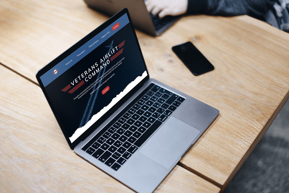
Over the course of this design sprint, the aim of this project is to redesign a responsive website with the target audience of donors in mind to bolster their operational capacity.
Timeline
3 Weeks | December 2021
What I Did
-
Liaison to agency stakeholder
-
Audited existing site
-
Authored research plan, conducted interviews, and synthesized data
-
Led revisioning of information architecture, navigation, user flows, and use cases
-
Designed navigation system
-
Delivered wireframes, prototypes, and conducted user testing
Team
-
1 Project Manager
-
3 UX/UI Designers
-
1 Client Stakeholder

The Challenge
When meeting with stakeholders, we learned that VAC’s legacy website has been in existence for nearly 12 years!
While it has served the organization well, there are now significant drawbacks that make it challenging for their primary users: clients, volunteers, and donors. From the outset of the design sprint, we noticed a few major limitations:
-
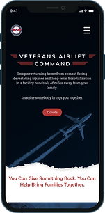
Non-responsive web design
-
Navigation & information hierarchy issues
-
Designed navigation system
-
Outdated & unrecognizable UI components.
The Solution
In creating a solution that would work across devices, our redesign focuses on growing the donor base by:
-
Upgrading navigation
-
Applying a research-informed content strategy
-
Improving accessibility through responsive design and updated UI


Our Methodology


Interviews
Initially, we delevoped proto personas for each representative user of the VAC. (client, pilot, and donor)
Upon further conversation with our stakeholder, we learned that the highest priority of the website was to drive donations.
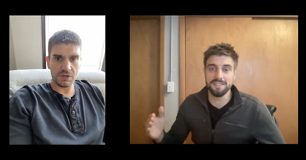
This led us to narrow the scope of the redesign to potential donors. We recruited and interviewed 6 people who were either veterans or families of military members.
Synthesizing Data
We found immense value in reviewing transcripts, seeing common themes that built a foundation for the future work of our project. Here’s what we heard:
-“Supporting veterans after active combat means supporting the whole family. That’s critical in the path to healing.”
-“As a veteran myself, it’s important for me to continue giving to quality programs that support military families.”
-“While open to donating on a recurring basis, I like to give when I can very practically see there’s a need.”

Analyzing the data brought out important collective user values foundational to our future design.
Trust & Credibility
One consistent theme across our interviews was that donors gauge their trust by certifications, testimonials, and clear depictions of how funds are used.
Easy Navigation
Without difficulty, donors expect to find a pathway to donate or inspiration to give. Otherwise, they will likely abandon the site.
feeling of affinity
We heard time and time again in interviews that military experience shapes a person for life. Visuals that depict a shared experience are significant motivators.
Meet Our Persona

Our Persona in Context
Since our stated goal was to maximize the pathways for an individual to donate, we had to imagine when and where Britt Baker would be likely to visit VAC's site. As a team, we talked extensively about likely scenarios based on insights from our interviews.


Reimagining the Site's Architecture
Now knowing our persona’s pain points and goals, I led an open card sorting exercise aimed at additional donation pathways.
The legacy website included only one donation button on the bottom of the home page, so there were many options to improve the system.
The challenging part of ideation was having multiple viable solutions while at the same time committing to a redesign that would be simple and straightforward.
Ultimately, we decided to prioritize three key features that would meet the needs of our persona.
Express Donate pathway
For those who want to visit the site for the sole purpose of donating, this pathway will be given prominence.
Integrated Donor CTA's
While there are users who want an express donate option, others visit to find affinity and inspiration. CTA’s need to be strategically placed to make donating seamless.
Create Blog section
The legacy VAC site currently uses blogspot for story purposes. Creating a dedicated internal section offers another connection point with potential donors. (A plus for SEO too!)
New User Flow
As we moved closer to a solution, it was important to map out the journey and decision points of our redesign. I created a new user flow that aligned various motivations for giving identified in research with the overall jobs to be done of the site.

Low-fidelity Wireframes
With a firm understanding of our persona and the reimagined paths to becoming a donor, we began sketching potential versions and features of the VAC's primary pages.
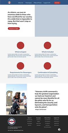
These select wireframes outline the required interface elements needed to fulfill goals of our users and meet business goals of VAC.


Style Guide
Before ramping up fidelity in our designs, we custom-tailored a style guide for our persona Britt Baker.
Given the potential limited technology use, we wanted a system that would be simple and straightforward while delivering on the need to instantly resonate with visuals.
We moved forward with those two mandates in mind: ensure accessibility and inspire with familiar visual aesthetics.
Increasing Fidelity & First Prototype
We then chose to apply portions of the style guide and incorporate a few new elements from our competitor analysis. To name a few of those changes, we incorporated cards to visualize VAC’s value proposition on homepage, built out a multi-step donation form, and designed dropdown menus in the top navigation bar.


User Testing
We conducted a round of user tests on our mid-fidelity prototype, asking them to complete three tasks:
Task #1: Make a one-time donation to VAC.
Task #2: Set up a monthly recurring donation to VAC.
Task #3: Donate a custom amount to VAC.
Users moved through these tasks with relative ease, but also provided valuable insights for improvement. We chose to incorporate many improvements in our high fidelity mockups.
The more impactful changes were made to our donation page, where we added more guidance for users with a stepper, success message upon completion, and “back-to-home” button.
Task #1
Average Score = 1
Task #2
Average Score = 0.8
Task #3
Average Score = 1
Scoring Criteria
1 = Completed Successfully
0.5 = Completed with Assistance
0 = Unsuccessful Task
The Outcome
As we currently stand, the final prototypes have been developed and our team is in conversation with VAC regarding a developer handoff.
Given the fact that the legacy website isn’t responsive to mobile, it was energizing to work on this project knowing the potential impact this could make for both VAC donors and the organization overall.
Outside of a developer handoff, we see potential from our competitor analysis to set up an employee giving section of the website and could also increase content in the blog section.


